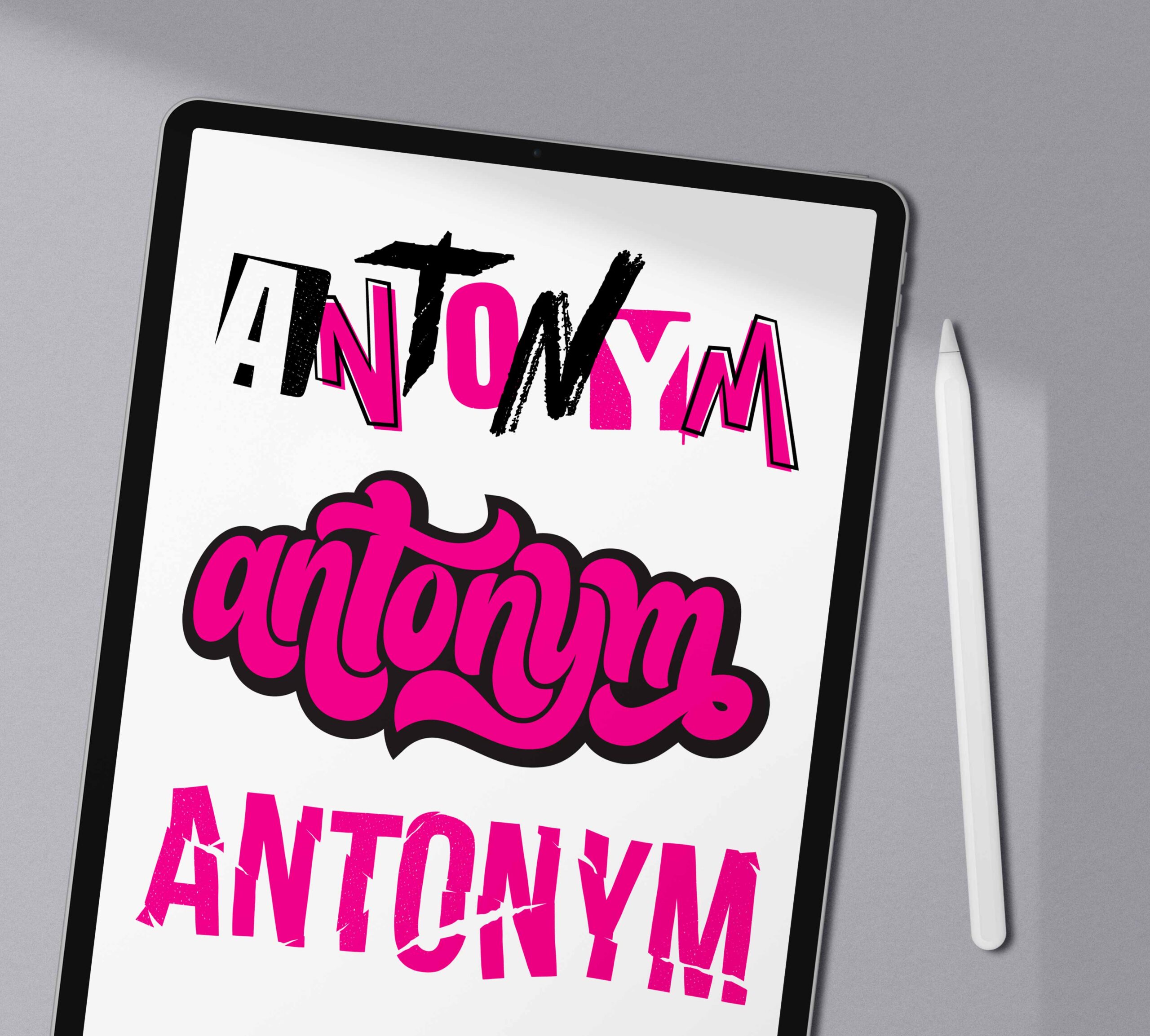
Antonym Logo Lettering
Hand-lettering
The owner of the Antonym Agency, a design agency that applies a bold and exciting method of design to their clients visual needs, approached me this year about contributing to an animation he was creating for his brand that played with redrawing his original logo in different styles. Yes, please!
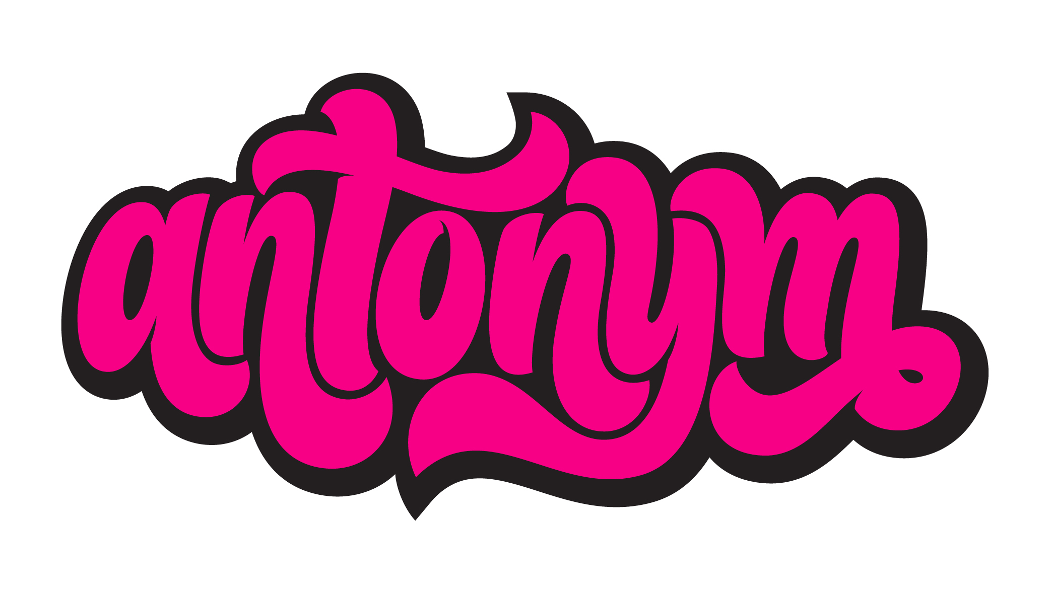
The first hand-lettered iteration was designers’ choice (music to any creatives ears), so I went with a style I personally adore and enjoy drawing: a funky, chunky look with letters that play together like puzzle pieces — a sharp deviation from the original angular, geometric style. Strategically placed, little cut-ins where shapes overlap and connect, add a bit of extra character and give the letterforms added body. Then, to anchor the whole piece and underscore the interlocking quality in the negative spaces, I added a slightly offset drop shadow to finish it off.
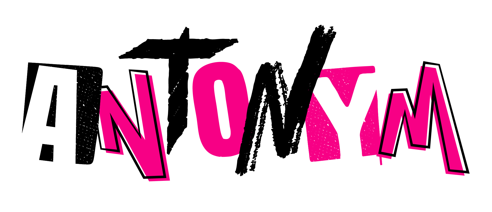
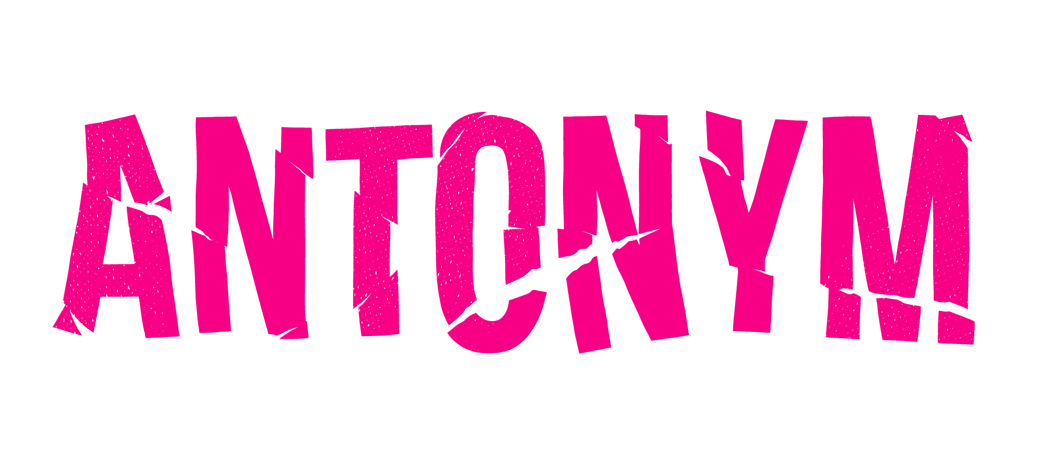
For the next two logo variations the client wanted to go with something that was a bit more edgy and punk. Think grunge shows, skyscraper mohawks, and fits characterized by their decorative use of safety pins and spikes. The first played on the chaotic, mix n’ match approach inspired by retro punk rock album covers and flyers, where letters are cut from different source materials and modge-podged with hand-written characters. I utilized a variety of hand-drawn styles and textures to mimic the zeal and intentional disorder of the old-school designs, while trying to retain a graphic and harmonious feel that could be easily intermixed with the other styles of lettering in his animation. The second plays into this intentional chaos using a style that mimics torn paper, pulling the letters apart and strategically arranging the pieces to create a naturally torn look. This method gives the custom type a scrappy energy and fragmented movement that speaks to the distressed, punk vibe.