Cherry Blossom Run
Hand-lettering | Illustration
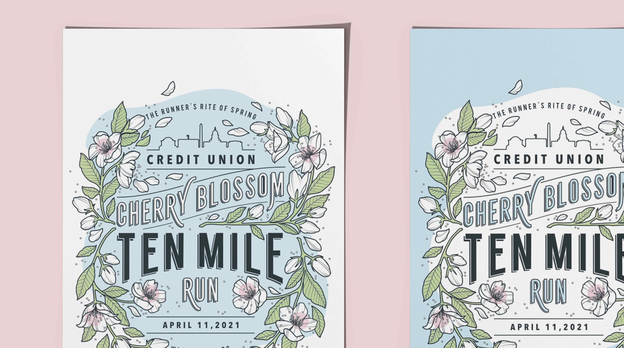
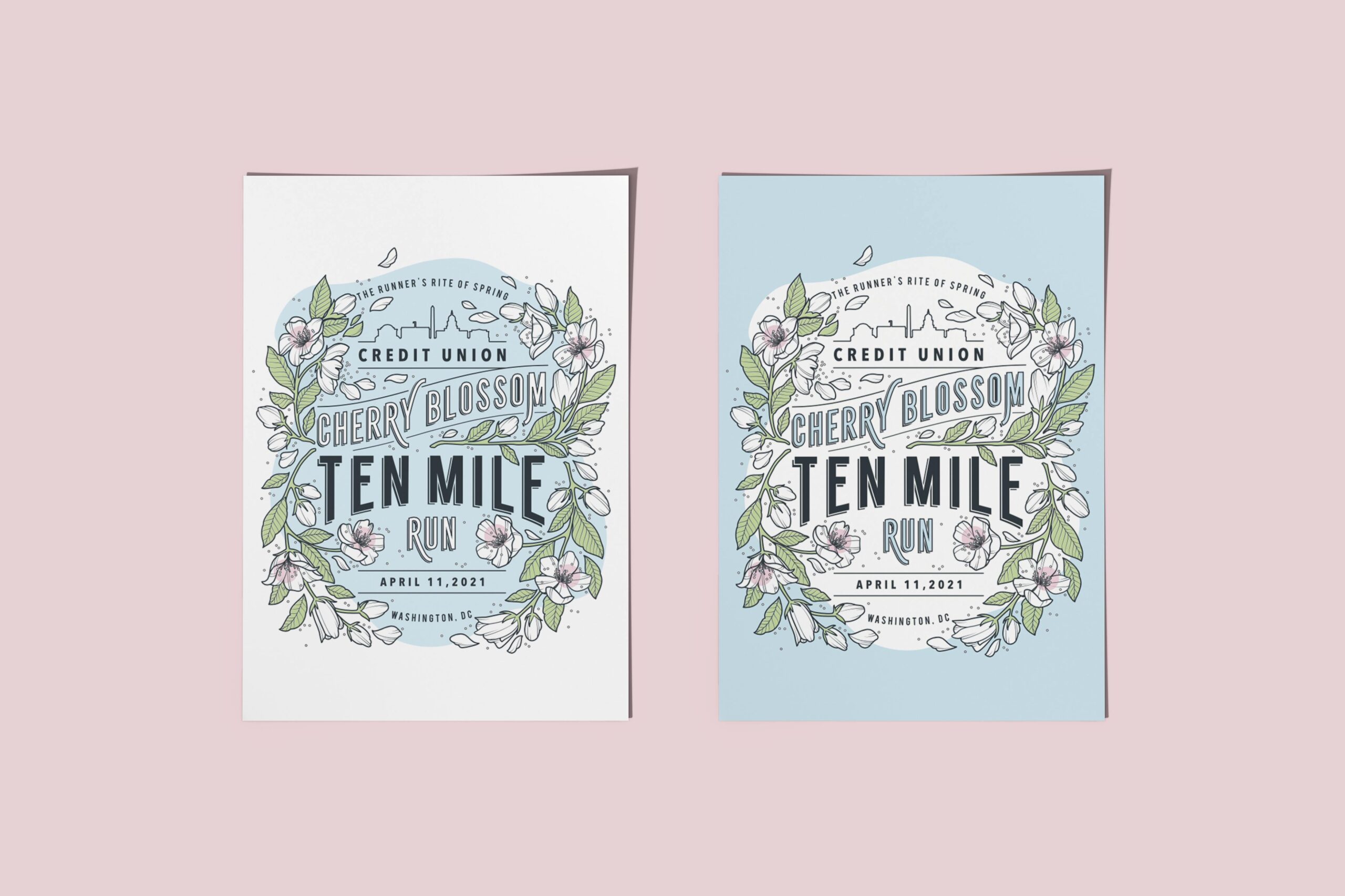
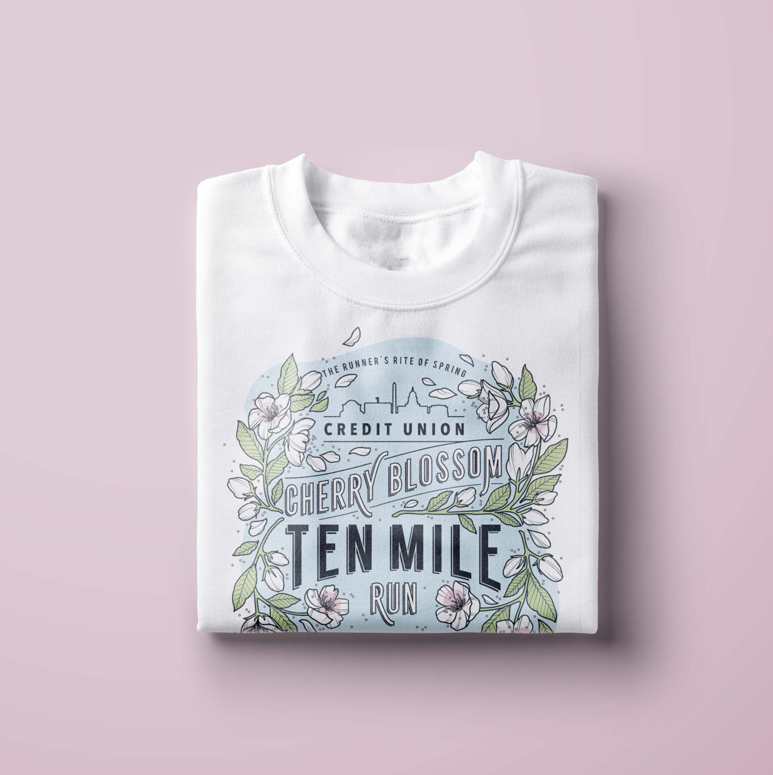
This illustration featuring custom type and hand-drawn cherry blossoms was designed for the Credit Union Cherry Blossom 10-mile run in Washington DC. Made to work as a race shirt, flier, and then become the visual basis of further event collateral, this piece had to include a lot of content while retaining the appropriate hierarchy, be easily legible, and be cool enough that people would want to wear it as their post-race swag. Nothing like running your heart out at a race you’ve been training for just to be disappointed when you get the goodies at the end.
I started with the biggest obstacle — typography. With so much content, hierarchy was essential, making sure the content was read in the intended order and that the most important information was front and center. Once I established this with scale and composition using a stacked type approach, I was able to have a little fun with the letterforms, adding drop shadows and curving elements for typography that felt clean but sweet. With cherry blossoms being a DC icon and the main theme of the race I naturally felt it was important to visually represent them as one of the main elements of the design, so I hand-drew a frame of blooms that became the container for the rest of the illustration, weaving in and around the content. To finish the piece, I snuck in a silhouette of familiar DC landmarks for my all my locals. While the race coordinators ultimately chose to pursue a different visual route, this is still one of my favorite pieces to date.